Why designers hate Comic Sans font?
June 22, 2018 in Design | 3 mins read | Tagged: design typography font
The short answer to the question is “designers understand typography well”, but the long answer needs this article.
If you google “world’s most hated font”, you should see the first 10 results saying “Comic Sans”, and it’s the same with other search engines like Bing (a Microsoft product) and Yahoo. The reason behind that comes in two parts, a. People overusing Comic Sans, usually without any care about choosing the right font for the document, and b. Is that because the font itself was created with lousy attention from the designer, or else he could put more efforts into making it more beautiful.
A. People overusing Comic Sans
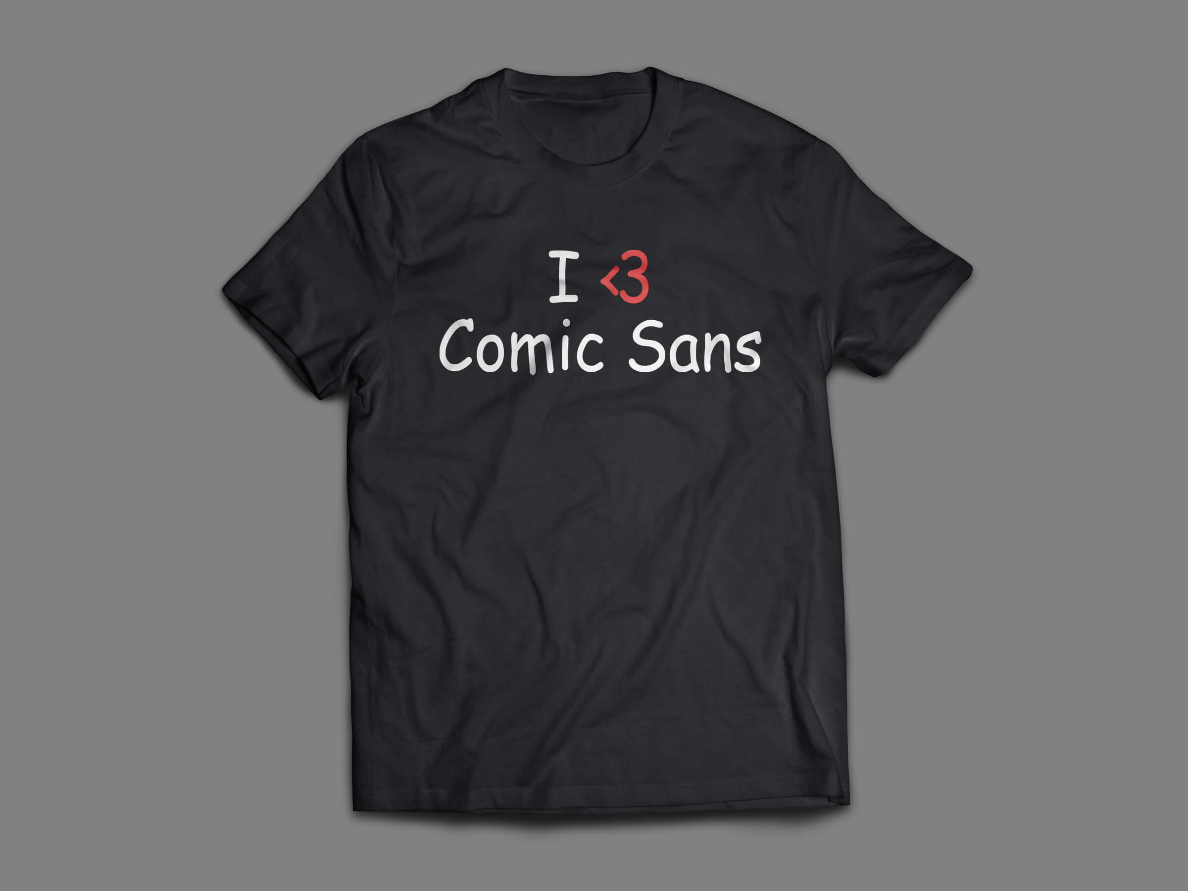
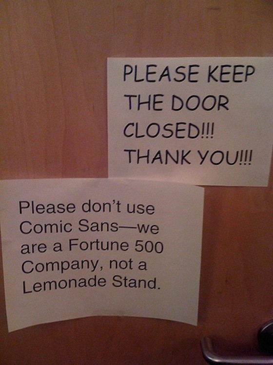
Despite the fact it’s the most hated font ever, people around the world tend to use it everywhere, whether that was an official document from the government, an extremely important sign for an event, or, as I saw it, in a serious scientific research paper or poster. You literally see Comic Sans everywhere, on a shop’s door or on a t-shirt. You may ask, how I know that people used it with no care, the answer is that people never lookup an appropriate font to use with the purpose they’re using that font. As an example of what I mean by appropriate font, let’s just say that an Irish pub abroad uses a straight regular font like Helvetica, and the next-door pub is using a Gaeilge-like font, which pub are you going to trust as Irish? It’s the same with Comic Sans, people are using it just because it looks fun, friendly, and handwritten to show that they aren’t serious and mean. For designers, that’s annoying and create a drawback of trusting people handling their stuff. If I personally see that an HR personnel is using Comic Sans on a document, how can I trust that person with my photo being printed on my contract?
B. Comic Sans’ Designer Attention
The font was originally designed to be used in a Microsoft program to teach people about computers using comic like characters, that program was called Microsoft Bob, which never saw the light, but the font was selected by Microsoft and reached Windows list of fonts. Since the font was created in 1995, and tools to create fonts were not as good as today’s, the font turned out to be the ugly beast we see today. Nevertheless, the font was created to be used for an one-screen application, NOT to be printed on documents! That in a way doesn’t make us forgive the designer, as way older fonts still follow the basics of good font. But Comic sans has very bad characteristics as shown below.
Font Problems

- In the text above, notice that all letters’ lines same shakey as if they were drawn slowly rather than being sharp lines with a good artist hands.
- The spaces between letters called “kerning” and letter fit, look at the space between F and O, and then look at the space between O and X. Do I need to explain more?
- Notice the far right line of the letter N; it’s thinner than any other letter including H which uses the same shape.
- Look at the letters OX and check how X is higher than O. Basically, you can see that the font looks like it was designed in 30 minutes, and got accredited by Microsoft later, and so people took it from there.
Can I still use Comic Sans?
 You can use it for your kid’s lemonade stand, you can use it for any childish design, and you can use it to annoy people. That’s all the possible ways to use it.
Rather than that, the answer is NO.